It’s pretty amusing to look back at old websites and see how static (read: boring) they used to be. One of the things that often catches me off guard is seeing website designers old take on a header. Usually it’s just a plain banner which may or may not have been made using MS Paint.
Headers have improved in leaps and bounds from the old static banner. Now it’s common for websites to feature a slider. This slider displays products, features or articles as though the visitor is being shown a series of movie trailers. Not only does this catch the viewers attention, but it also allows them to navigate the site easier and be introduced to pages they otherwise didn’t know existed.
But then sliders stepped up even more. Now they feature animations and text. Take for example this slider on Urban Homes, master builders in Hamilton‘s website. Their About page features this cool and interactive slider. Check it out here. Here’s one transition in motion:
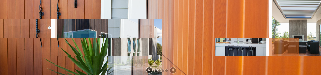
Website designers in the past may have gasped at this slider. Not because of it’s unique take on their banner, but because of the changing transitions. Website designers in the past valued consistency. However changing up the transitions captures a viewers attention – it keeps them alert. Any website designer should know the aim of a website is to capture and hold a visitors attention.
It’s quite possible that sliders haven’t yet peaked. I think sliders will continue to be animated – except not only will they be animated, they will also animate people. Following the web’s trend towards personalisation, it wouldn’t surprise me if sliders matched visitors interests. So instead of sitting through a mixture of commercial and residential design projects, a business owner would only see images of commercial building projects.